Sizzle


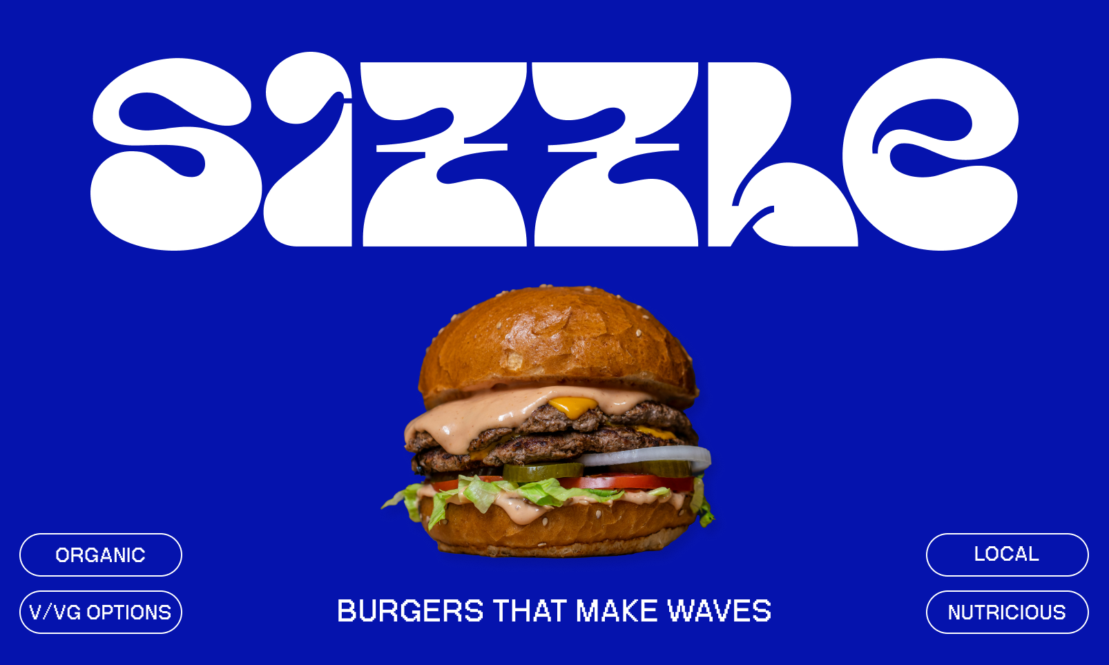
Burgers that make waves.
Overview
Sizzle Burger Co. is a contemporary fast-casual burger chain that aims to deliver not just great food, but an unforgettable brand experience. With an emphasis on organic ingredients, playful design, and retro flair, Sizzle seeks to carve out a unique identity in a competitive market. This case study outlines my role in developing the complete branding for Sizzle Burger Co., from logo design to visual identity, and how it helped the company establish a strong presence in the market.
Challenge
Sizzle Burger Co. needed a fresh, modern visual identity that would resonate with a younger audience while staying true to the timeless appeal of a classic burger joint. The challenge was to combine nostalgia and modernity, with an emphasis on organic ingredients, sustainability, and community values, while maintaining a fun, approachable brand image.
Process
Brand Discovery & Strategy
The process began with a deep dive into the brand’s mission and target audience. Sizzle’s core values of organic ingredients, fun, and local pride shaped the direction of the design. Through client interviews and market research, I established key pillars:
- Fun & Playful: The brand needed to be engaging and approachable.
- Fresh & Organic: Emphasizing quality ingredients and sustainability.
- Local & Vibrant: A brand that celebrates local culture and the spirit of community.
Logo & Typography
The logo design was a key element of the brand’s identity. I created a custom logotype using a bold, rounded font to give the brand a friendly and approachable appearance. The word "Sizzle" was designed with curves and playful distortion to reflect the dynamic, energetic nature of the brand. I incorporated elements inspired by retro typographic styles, giving the logo both a nostalgic and modern feel. The logo needed to be versatile enough to work on everything from menus to storefront signage and digital media.
The logoform was then used to create a wave pattern, leading to the playful slogan "Burgers that make waves".


Color Palette
The color palette was carefully selected using colors that are not typically seen with a burger brand, adding an element of differentiation. Vibrant blue was chosen for its fresh, bold, and clean appeal. Paired with creamy beige, the palette evokes a sense of nostalgia and beachside relaxation, aligning with the laid-back, Honolulu-inspired vibe of Sizzle Burger Co. These colors are used consistently across all visual materials to create a cohesive and memorable brand identity.
Illustrations and Mascot
To reinforce the playful nature of the brand, I developed a series of custom illustrations, including a mascot character—a fun, animated burger with legs and sneakers. The mascot became a focal point of the branding, bringing a lighthearted touch to everything from packaging to in-store graphics. The character’s expressive design helped further humanize the brand, making it approachable and relatable to the target audience.
Application
I applied the branding across multiple touchpoints, ensuring a consistent brand presence:
- Storefront Signage: The logo and illustrations were prominently featured on the storefront, helping to attract attention and set the tone for the in-store experience.
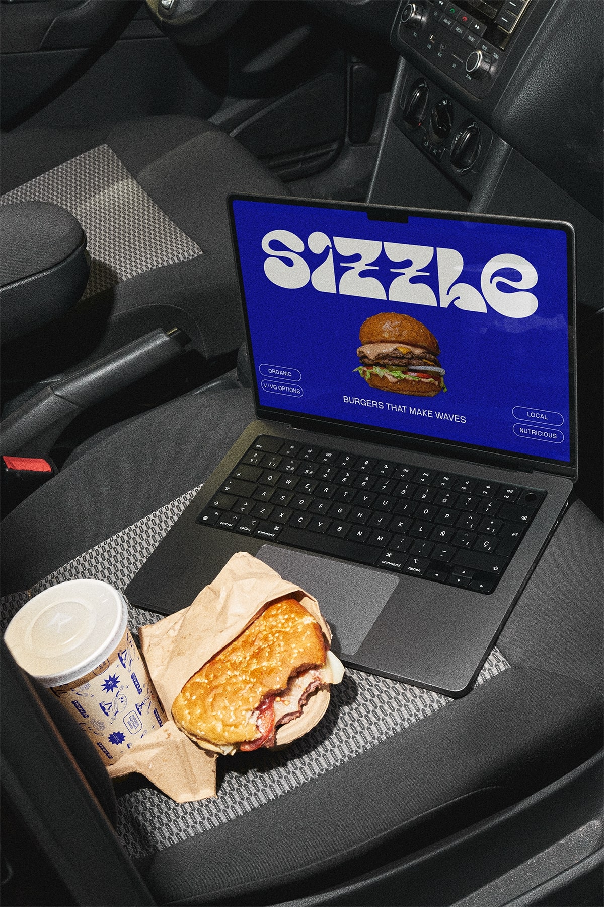
- Packaging: Custom-designed food packaging, including burger wrappers and napkins, reinforced the brand's playful tone while highlighting the quality of the organic ingredients.
- Marketing Collateral: I designed menus, business cards, and promotional materials, maintaining a cohesive visual style that speaks to the brand's core values.
- Social Media & Digital Presence: The branding was extended to digital platforms, ensuring the visuals translated seamlessly into Instagram posts, advertisements, and other social media content.
.png)


Conclusion
This project allowed me to combine my expertise in design, branding strategy, and visual storytelling to create a memorable and cohesive identity for a brand in a competitive industry. The success of Sizzle Burger Co.'s branding was a direct result of understanding the brand's values, target audience, and how to communicate these elements through design. The experience further honed my ability to deliver design solutions that not only look great but also resonate with audiences and drive business success.


